
No items found.
No items found.
No items found.
No items found.
No items found.
No items found.
3sat Logo A key element is the newly redesigned logo, which retains the previous identity but now consists of three individual parts. This composition emphasizes the shared DNA of the broadcaster even more strongly: In addition to its own produced magazines, 3sat’s programming brings together the most important cultural, scientific, and societal programs from the three partner countries.
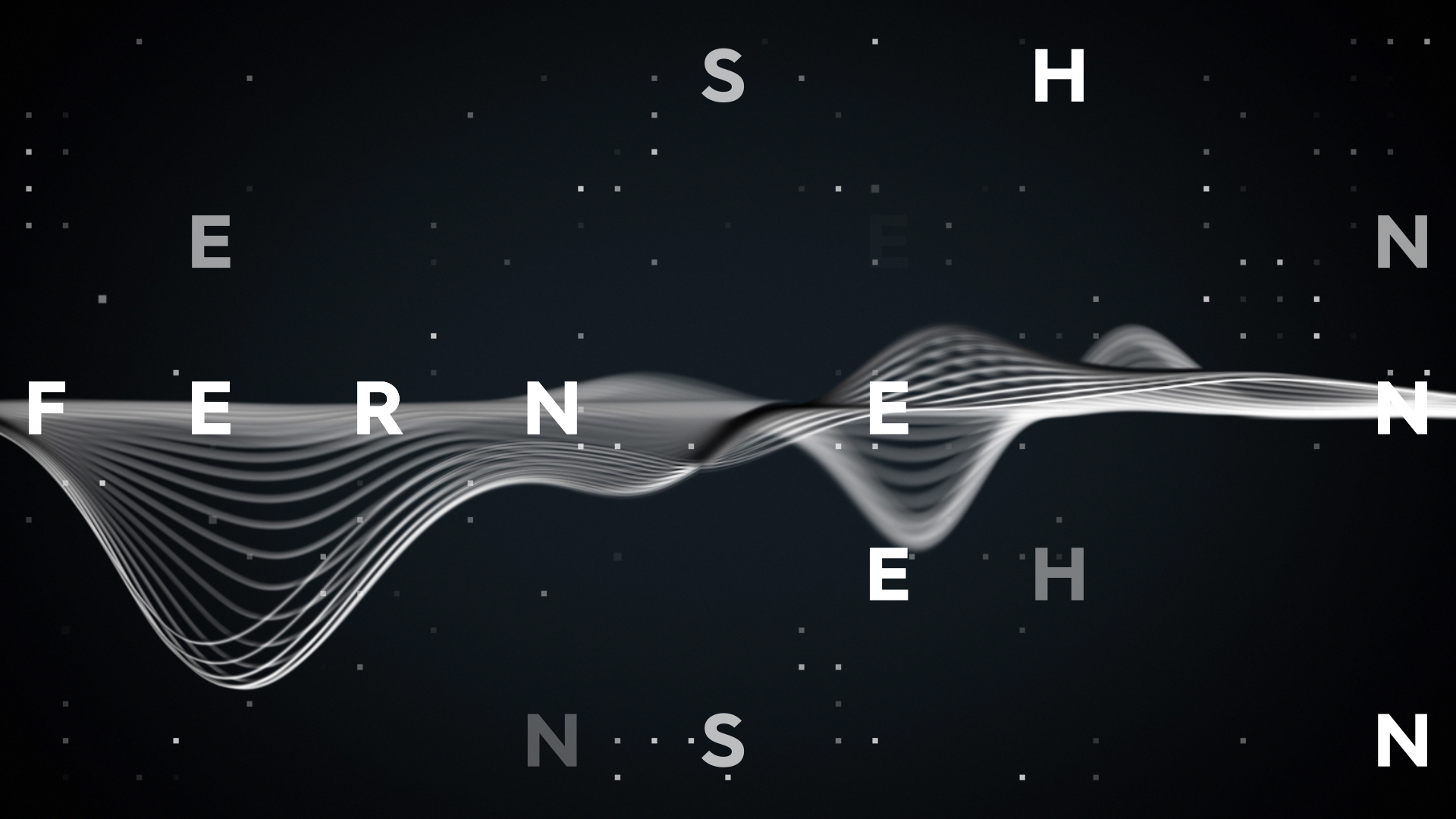
3sat New Custom Typeface We designed a custom typeface that harmonizes perfectly with the new logo. The rebrand is strongly defined by the typographic design and the overall animation concept.
3sat Labels We design a comprehensive visual package and develop a key visual for the opening titles of diverse television programs. While we create a cohesive graphic package, we also craft unique, individual elements that are brought to life through custom shoots—just like we did for the show Starke Stücke, where we combined design and live-action to create a dynamic and engaging visual experience.
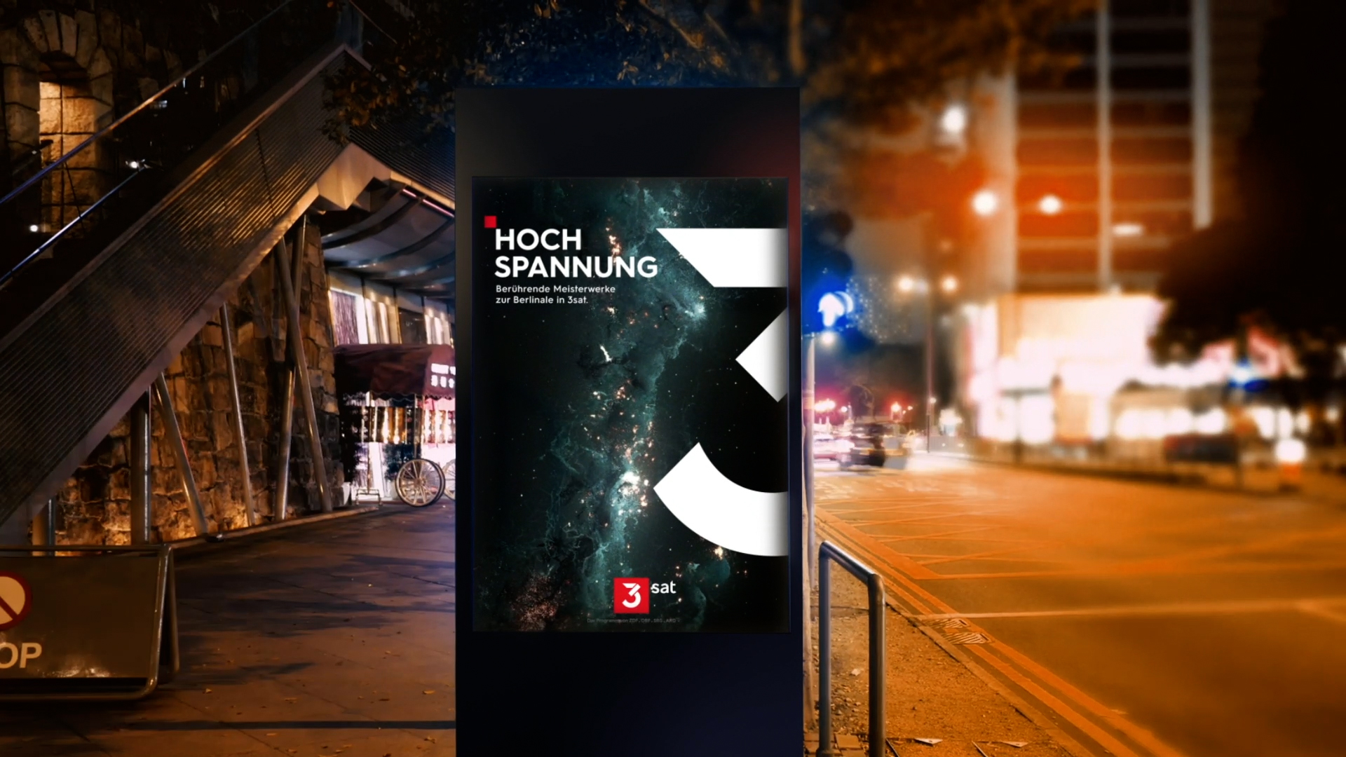
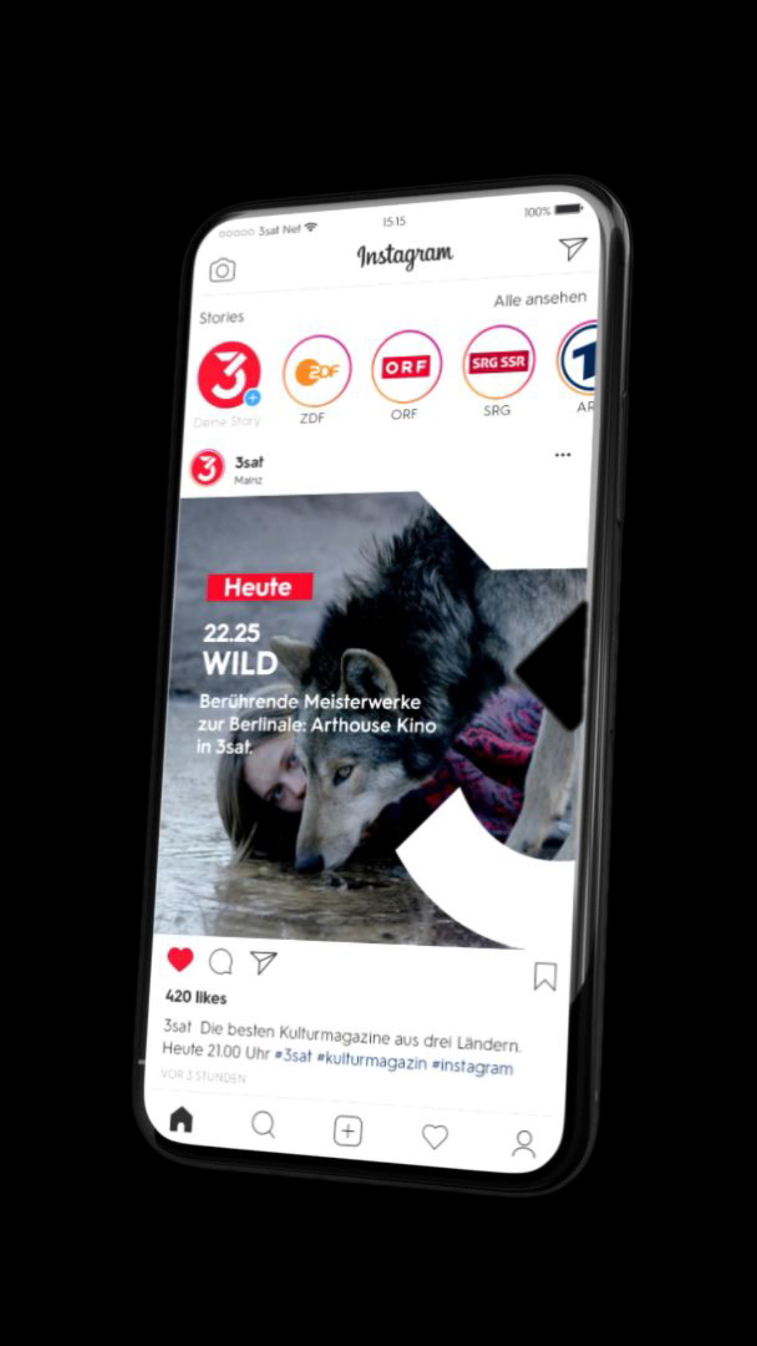
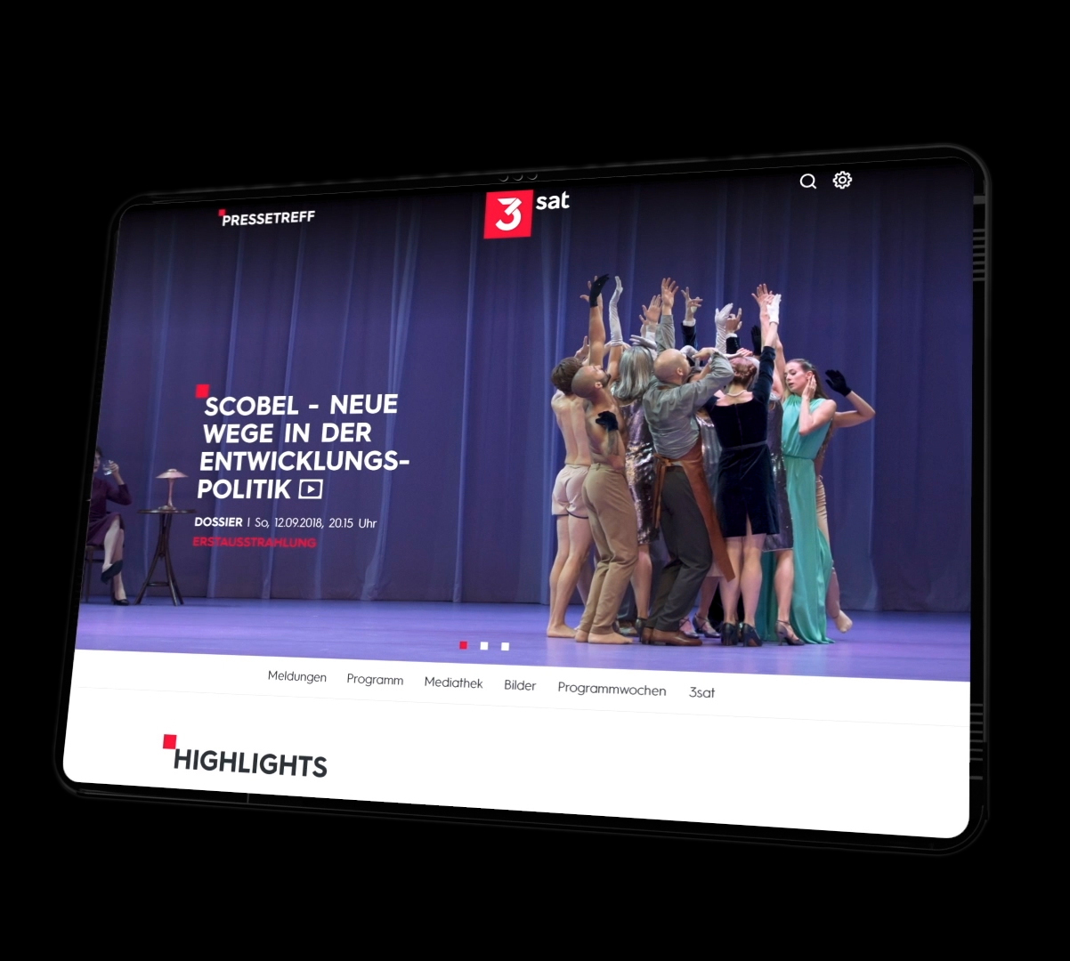
Off -Air